Wednesday, May 13, 2015

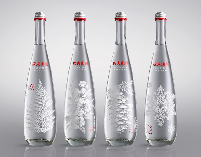
Nongfu Spring Mineral Water - by Design Agency Horse (UK)

Considering this is the leading bottled water manufacturer in China, it is very interesting that they decided to go with a British design company when creating their bottles. The red lettering of the company is a nice touch and really stands out in comparison to the white lettering and designs. The designs on the front of the bottle were probably limited edition, since they are Christmas colors
 and designs. A message from the company states: "Produced for high-end restaurants, bars and hotels, the bottles feature eight different plant and animal species from Moya Spring, at the foot of Changbai Mountain - the volcanic region bordering China and North Korea that produces the water."
The designs are not etchings, instead they are printed on the bottle. With twelve different designs, the company really went for uniqueness. So for a product that is marketed to high-end restaurant in China, this is perfect.

Mount Franklin sparkling - Designed by Samantha Wills

This is a bottle design with a lot of detail all over. It looks like designer water because plenty of care was placed into the design. It stand out because of the hand-drawn images and bright colors utilized. The design around the top of the bottle is very intricate as well. However, the logo and name of the product does not mesh well with the rest of the design, if fact, it looks like a separate piece entirely. It looks like the type of water that would attract people who have been to Caochella music festival. There is even a woman on the front wearing a feather headpiece. The design is definitively aimed at a younger audience.

Mount Franklin & McGrath Foundation

Danube bottled water- designer unknown

The bottle itself is a very elegant shape that serves the purpose of looking like the type of expensive water you would find at a dinner party for wealthy patrons. With the all over blue wave design, it looks simple enough to sit out anywhere in the kitchen and still look in place. I really like how a sans serif font was used for the company name, and the two little bullet points at the end are a nice touch. I kind of wish this would do a little more to stand out. The company name is a nice association with a large river in Europe, which also adds to the feeling of European class. Maybe a little too simple, but overall a good design.

visualgraphic:

Danube
Mezcal Meteoro - designed by Francisco Rueda

This is a brand that wants to be known for using traditional methods when creating their agave alcohol, so it makes sense that everything on the bottle is more old-fashioned, but not the point of looking out-of-date. The Type of the label is a nice Sans-Serif font, which is what makes it look slightly modern, but it is simple enough for people to read easily, and the placing of everything on the label was well thought-out. The little detail of the line going into the "O" is a nice touch that reminds people of a meteor. This product is hand-crafted with care, and the little leather strip going over the cork in the bottle is a nice little reminder of that to the consumer. This bottle is also a really nice touch, since it is simple enough that people will want to empty it out just  to have it sitting on the shelf in their home.

ekoBrachia - design by Izvorka Juric

This is a good way to sell olive oil. This brand identifies itself as being eco-friendly, from every aspect including the recyclable label made from recycled product. The leaves sticking out on the bottle are a nice touch, since people will associate the product more with nature. The bottle is a decent size and shape, none of the awkwardly-shaped bottom-heavy bottles you see in the grocery store. The green and white are a nice complement to the brand, since there isn't anything black and heavy or bulky on the design, people will associate this product with more delicate tastes. The type of the label is really nice, and looks classy enough to go straight to the dinner table.

Amstel - bottle Designed by P.E.T. Engineering - The Netherlands

With the older design of the Amstel bottle, there was a big label placed on the product and crinkled gold foil placed over the bottle cap at the top. The fact that Amstel decided to get rid of the big label, and instead place the company logo as an etching onto the bottle itself is a nice update. The foil cap cover on the old bottle  did not do much for the overall aesthetic, so the label and the cap cover appeared as two spate pieces. The embossed Amstel stamp is a much better idea, because the customer can feel like it is the higher-quality beer that it is marketed as. The bottle cap cover and the smaller wrap-around label are much more cohesive. A good design for a certain kind of customer, Amstel decided instead of having the bottom of the bottle look flat on the table, they would shape the bottom since they switched from a glass to plastic bottle.
Ouzo - illustrated by Viktor Gountaras

This is probably a cliché drink in Greece, but it is something that has a history with the country. Designed to unapologetically appeal to tourists, this is a bottle that borrows plenty of elements from Greek history and culture. Using many hand-illustrated images that give a brief example of the local history and culture, these bottles serve as a nice souvenir on their own. With the different designs for each color, the makers of this product did not want to stray away from allowing their product to stand out. The colors even work well together, if you line them up on a shelf in a bar or liquor store, they look associated enough for people to realize that this is the same product with more vibrant packaging. The only thing I don't really like about the design of this product is the name of the product just seems to be written on as an afterthought. There also should be at least some sort of description of the product, so people who are not familiar with the brand can get some sense of what the company and product is.
Isolente - designed by Diego Ballester

It is very nice to see a matte black background and a rose-gold print that stand out in a good way. It is very easy to get a metallic design wrong, especially if it is overused. But the metallic of the logo and the metallic of the bottle seal manage to coordinate and tie-in well together. The fingerprint of the logo is a really interesting piece that you don't see too often. The fingerprint design makes you think that the makers of the wine want to put more than just their seal on this product. Not to mention, the design does look like someone holding up their middle finger to you. The people who see and realize that is detail will find the humor, and become more interested in trying the product. Even the product's name 'Insolente' is an irreverent little quirk that serves the design well.

Toscianello Sparkling wine - design by Andrea Castelletti

This is another effervescent design, this time by a maker of sparkling wine. The design of the small dots goes well with the association of a carbonated beverage. With a simple white background, this design does not appear to be too cluttered or stifled, its actually more on the minimalist side.  The use of the letters of the brand that make up the label floating in the dot design is an interesting aesthetic, made slightly more eye-catching with the addition of gold lettering. Overall a very good and well-placed design.

Yuju water designed by Juan Jose Montes

This is probably the best I have seen from a juice that wants to market itself to small children. The bottle shape is great for small hands, because it is shaped slightly more like a ball. The little sketch-design pictures on the sides are unique to each flavor, something that makes this product appeal even more to small children. The labels of the flavors are in a font that is easily legible because it all caps and looks to be handwritten instead of in a serif font. I like how the name of the brand is in rounded letters, something that also appeals to smaller children, and even the name of the brand is something cutesy. The fact that there are little pictures drawn below the flavor is great for small children who do not know how to read yet. Overall, a very well-thought design.


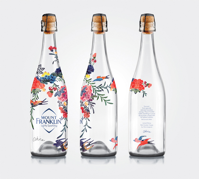
Mount  Franklin  lightly  sparkling

This is probably one of the most effervescent and quirky pieces of bottle art I have seen in a while. The design of the birds and flowers is hand painted, which only adds to the flair. This is definitely going to stand out on the shelves of a supermarket. The bottle itself is an older cork-stopper design, which is refreshing, although it may not be for everyone that likes screw caps. This is almost Japanese in design, because of the artwork involved. The description on the front of the bottle doesn't really flow with the rest of the design. but the description on the back is a nice touch.


12 9 13 MountFranklinLightlySparkling 3

Wednesday, April 22, 2015

Dr. Jekyll is in the lab again....

This is a really creative way to market a product, and to any literary person familiar with the story, the pun will be understood. Dr. Jekyll is in the lab creating a delicious gin cocktail, which causes him to turn into Mr. hyde after he drinks a flask (or in this case, an Erlenmeyer flask) of the piney beverage. The fact that they even bottled it in Chemistry glassware is just a really good, original idea. The only thing that really annoys me about the bottle, is the type used. There appear to be more than three different typefaces used in this design. And one of the golden rules of design is only use three typefaces sparingly, but in most cases, use one or two. 'Mr. Hyde' could have been done without the shadowing, and an old-school serif font would have worked better, since the story of Dr. Jekyll and Mr. Hyde is more of a Victorian-era and it would be more fitting. What I didn't notice at first, but I like is the thin white flora behind the product name. It ties in very well with the old story, and I would love to own a bottle, just to put it on a shelf and look at it.


Champagne? No, its wine.

Using Willowy branches on the bottle of an alcoholic beverage is not the most original idea (thanks Belvedere), but that doesn't mean it cannot still be interesting. Using curlier branches kind of makes the bottle look like its draped in lace at a distance. This design element is continued on the bottle wrapper to make it look even fancier. Having the label cut out in a circular shape since its placed on the cylindrical bottle gives a really good continuation. The use of gold with the color of the white Riesling just makes the wine look even more golden, and that's a nice draw for a customer who is just glancing through the shelves. The gold also makes people think of weddings and anniversaries and holiday celebrations, so it could be easily marketed as a wine for celebration. This is a well thought-out design and even though I have no idea who the designer is, its still a commendable piece of work.


Making water look interesting.

There aren't many ways to make plain old boring water pop off the shelf in the grocery store, so when a design like this comes along I actually sit up and take notice. Having looked at the plain old bottles if water at the grocery store, this is refreshing to look at. Very few designers would be ballsy enough to use this type of shape in a bottle. The geometric design is prismatic, crystalline, and interesting. The label on the bottle itself is very small and is a well-blended part of the design element. This however, looks like the expensive water at Whole Foods, which it probably is. The organic kind of water that you get specially imported from Norway and serve at fancy luncheons with pastel-colored macarons and bragging rights. This water looks like it is trying to sell a certain lifestyle, and it makes me want to know what its like to drink a prism.